Data Visualization
Overview
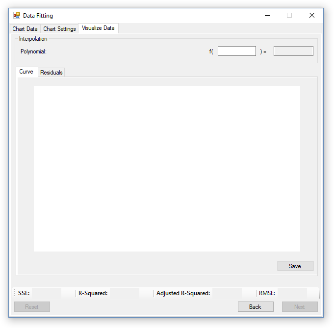
The visualize data tab is where the user can view the result their customization and regression settings, and view information on the goodness of fit of the trend line they created. The user can also reliably make predictions for missing values in the range of their data by using the interpolation tool at the top of the window, which is also where the polynomial trend line is displayed.
Fit Validation
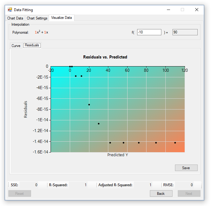
To validate the fit of the polynomial trend line, goodness of fit statistics and a residuals chart are provided. The statistics consist of the Sum of the Squared Error (SSE), Coefficient of Determination (R2), Adjusted R2 Value, and the Root Mean Squared Error (RMSE).
- SSE: The SSE value is the sum of error found in the residuals, which is the distance between the predicted and actual values. A SSE value closer to 0 indicates a better trend line fit.
- R2: The r-squared value is a value representing how close the predicted data matches the actual data. It ranges from 0 - 1, where 0 is no correlation, and 1 is a perfect fit. High and low values of R2 do not necessarily indicate a good or bad fit, and is dependant on the type of behavior the trend line was created to predict.
- Adjusted R2: The adjusted r-squared value resolves the problems with higher r-squared numbers due to a high degree polynomial. A higher adjusted r-squared value shows that the selected model is a good fit, and that it models the behavior of the data more closely than other models, even if other models have higher r-squared values.
- RMSE: The RMSE value is the average deviation of predicted values to actual values in the trendline, and when it’s closer to 0, it indicates a better fit.
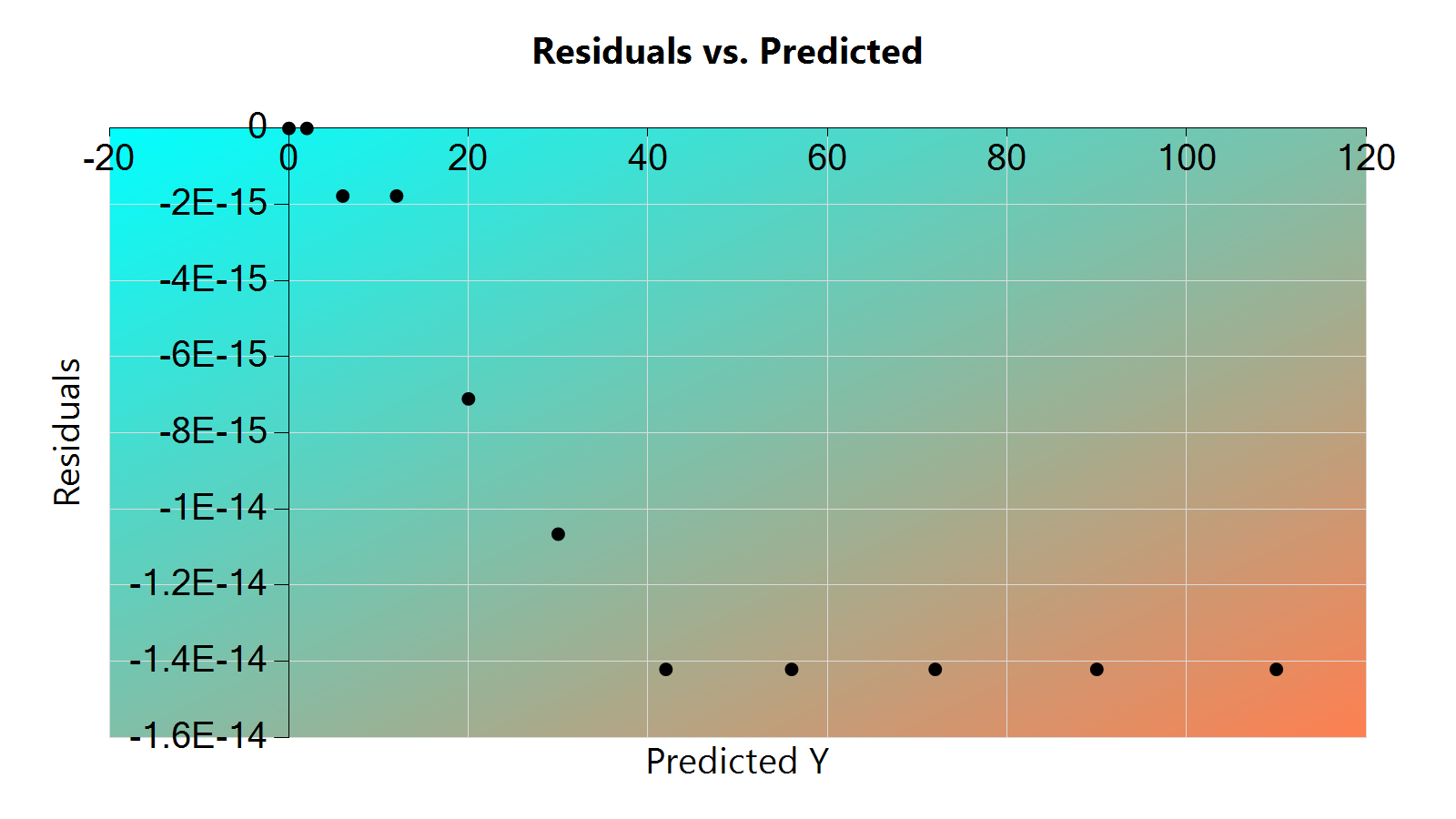
In order to have confidence that the statistics are correct, the user should observe the residuals chart. The residuals chart is the prediction of error in the trend line, and should contain values in a random pattern. If the residuals chart isn’t random, then there is a problem with the trend line and it should be improved. For the purpose of the Data Fitting application, this implies a change in polynomial degree must be made.
The image below shows a the residuals chart and statistics for the data entered at the beginning, and demonstrates a good polynomial fit.
Data Interpolation
Interpolation is provided at the top of the window in it’s respective section, and consists of a textbox where the user can type in x values. As the user types in values, the predicted value will be calculated and displayed to the right of the textbox where the x value was entered. If the user is so inclined, extrapolation is also possible, and occurs when the user types in a value not within the range of values given in the data set. Extrapolation is inherently inaccurate for polynomials greater than degree 1, unless one has been created for a predefined set of data that already has a matching polynomial. For example, if data had been recorded for the polynomial y = x^2 + x, the least squares method would be able to match that polynomial perfectly and extrapolation would be 100% accurate.
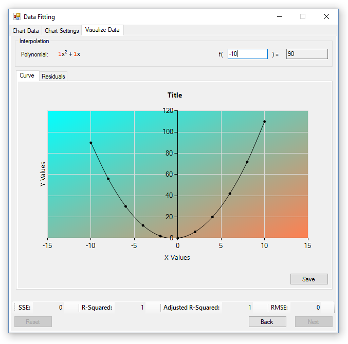
Final Chart Preview
Once the user is satisfied with the customization choices and trendline, they can preview what the final chart will look like in the ‘Curve’ tab. The preview chart has all the data, customization, and regression settings added to it, and is in the chart’s final resolution. If the user isn’t happy with what they see, they can navigate back one tab, and modify the chart’s settings as many times as they like, however, if they are happy, they can choose to save the chart and use it in other programs.
Saving Charts
To save a chart, the user must first navigate to the chart they wish to save, either the curve or residual chart, and press the save button. Charts can be saved in a variety of image formats, which include: bmp, png, jpg, tiff, and gif. Since charts are saved as images, they can easily be imported to other programs, such as websites and word documents. Below is an example of a saved curve and residual chart.
The curve chart: 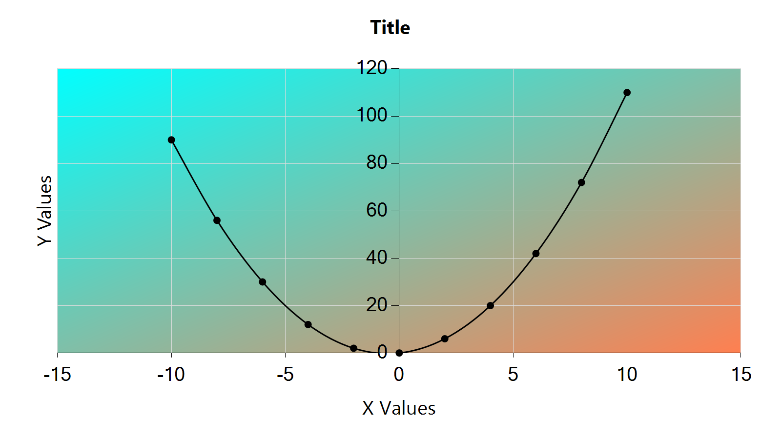
The residuals chart: